In this article, you’ll learn about the four core styles of Blackletter scripts, how to distinguish the nuanced differences between each of them, and how they came to be historically after centuries of typographical development. This knowledge will be help inform your studies of flat-pen and/or Blackletter calligraphy and make your journey more purposeful.
When the average western layperson thinks of calligraphy, there is no doubt many visuals come to mind. For most, it’s likely to be that elegant style of cursive we all know and love. Copperplate and Spencerian scripts, as we refer to them today, derived from the Roundhand style of calligraphy in the late 16th century. Sure, that was over 400 years ago, but in the grand timeline of calligraphy, it wasn’t actually that long ago. So what led up to that? And what about “Blackletter”?
“Blackletter”, “Gothic”, “Old English”, etc. You’ve probably heard these terms at some point and perhaps mental images of newspaper headlines come to mind. After all, those fonts are based off of classic “Blackletter” scripts, which is the word we use to describe these styles of scripts developed during Medieval times.
The history of Blackletter calligraphy is long and fascinating. Its roots date back to before 1200BC. That’s almost 3,000 years ago! Suddenly, several centuries doesn’t actually seem like so long of a time, does it?
Despite its long and rich history, exhaustive historic documentation of Blackletter calligraphy is fragmented and difficult to find. It is quite ironic how one can easily find a book spanning hundreds of pages that details just about any point in history. Yet, one cannot find a book detailing the history of the written language that built the foundation upon which we write.
With that said, this is a difficult topic to write about comprehensively. This article is carefully pieced together from many different sources and referential material. Any dates mentioned herein are approximate and span across over 2.5 millenniums. However, I’m confident that the timeline is accurate and that the details within will be more than sufficient in understanding and appreciating how Blackletter calligraphy has come to be what it is today.
Clarifying Terminology
We’ve established that “Blackletter” is the term we use to describe calligraphic type developed during Medieval times. What about “Gothic” or “Old English”? Though they have become synonymous with Blackletter script, these terms are actually somewhat inaccurate at their core. Let’s take a quick moment to clear up any confusion.
“Old English” was actually the language of the Anglo-Saxons until the mid 1100s and they had nothing to do with Blackletter. Centuries after Blackletter’s initial emergence, “Old English Text” was the name of a font by Monotype that mimicked 11th century Textura.
The “Goths”, as you’ll read about shortly, were actually Germanic tribes. However, the term “Gothic” was also used during medieval times in reference to the “Gothic” architecture, which was an architectural style found in many churches and cathedrals built during the Medieval era. And this architecture is important, as it was a major influence for inspiring blackletter calligraphy in the 11th century.
Though these styles can be used interchangeably, we’ll refer to it exclusively as “Blackletter” hereafter in the interest of establishing a common vocabulary.
What are the different styles of Blackletter calligraphy and how can they be distinguished from each other?
Before jumping in, let’s address one of the most commonly-asked questions about Fraktur (and subsequently, every other style of Blackletter calligraphy).
Blackletter is comprised of four styles; Textura, Rotunda, Bastarda, and Fraktur. Other styles were hybridized developments from one or more of these core styles. These styles developed between the 11th and 18th centuries. Over hundreds of years, their generational evolution was the result of regionality, education (or lack thereof), available materials of the time, religion, and politics.

With that said, there are no singular “textbook” forms when it comes to these styles of Blackletter. This makes establishing a holistic understanding of these styles and their nuances difficult and often unapproachable for novice scribes. But there are definitive distinctions that can be made between each style.
Consider a serif typeface. We all know that there is no one foundational serif. On the contrary, there are countless variations that fall into this broad category. Still, understanding the qualities this category of type is comprised of gives one the ability to distinguish whether or not a typeface is a serif typeface.
Think of a Blackletter script in the same way. Once you understand the aesthetic qualities of the four aforementioned styles, telling them apart them becomes easy. Bottom line — don’t worry about their differences. Instead, do your best to understand each one as an individual at its core.
The History of Blackletter Calligraphy
Now that we’re all on the same page, let’s go back in time and see where Blackletter, and subsequently, how all of the letters we use in the Western World today came from.
The Birth of the Latin Alphabet
Calligraphy is a term that refers to the written execution of alphabetic letterforms with a writing instrument such as a brush or pen. Cultures all over the world have developed their own unique forms of calligraphy in a variety of alphabets, each with their own unique history.
In western culture, we communicate with words formed with the letters of the Latin (also referred to as “Roman”) alphabet, which is the most commonly used alphabet in the world. It is this specific style of calligraphy that we’ll be focusing on in depth, as Blackletter calligraphy is written using characters exclusively from the Latin alphabet.
But where does the Latin alphabet come from and what makes an alphabet in the first place?
The first known alphabet was the Phonecian alphabet (also known as the Proto-Canaanite alphabet for the oldest of inscriptions). The individual glyphs in this alphabet were derived from early Egyptian hieroglyphs and each one represented a consonant. Alphabets with no vowels are referred to as an “abjad”, which is a writing system in which vowels are implied or determined by the reader based on the adjacent consonants.
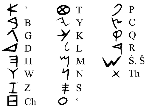
The Phonecian alphabet was used between 1200BC and 150BC throughout the Mediterranean, where it was adopted by many other cultures. These cultures continuously evolved it into other, more localized alphabets. One of those alphabets became what we know today as the Greek alphabet, which happens to be the first alphabet to have distinct vowel letterforms. Comprised of all capital letters, it was written in rows between 2 horizontal guidelines as a loose organizational layout method. However, reading from left to right was not an established rule at this time. The alphabet was often written in a “boustrophedon” format, where the lines alternate between right to left and then back from left to right.
The Greek alphabet dates back to 800BC and can still be found present in the modern day. Its glyphs are often used as technical symbols in domains such as mathematics, science, and technology.
The Greek alphabet is the ancestor of many other alphabets and writing systems, including the Latin alphabet, which set the foundation for the earliest traces of western calligraphy!
Old Roman Cursive (~2nd Century BC – 3rd Century AD)
Old Roman Cursive, also referred to as “majuscule cursive” and “capitalis cursive”, was the writing standard in ancient Rome for several centuries. The exact dates are unknown, but based on historic documents that were discovered from that time, and events that those documents referenced therein, its origins are speculated to go back to 2nd century BC.
Letterforms of Old Roman Cursive are comprised of characters from the Latin alphabet. The penmanship which was taught to children in schools and used most notably by business merchants and emperors as methods of communication and the recording of important documents.
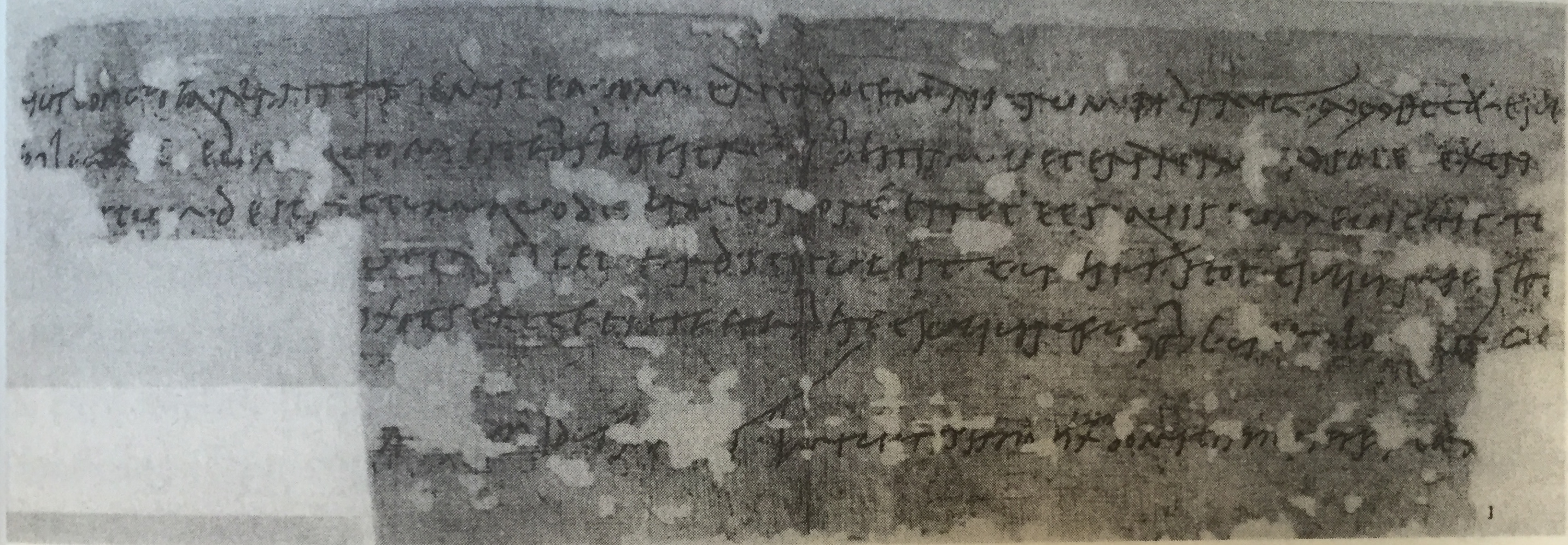
Recovered artifacts from that time reveal comedians mocking the script for its illegibility. Old Roman Cursive writing was often packed with ligatures as a shorthand mechanism which made it quite difficult to read. The proportion of individual letters and where they sat on their baseline lacked consistency.
New Roman Cursive (3rd – 7th Century AD)
Also referred to as “minuscule cursive” (and later, just “Roman Cursive) New Roman Cursive evolved from Old Roman Cursive. This evolution was likely a response to the older style’s illegibility. The characters in New Roman Cursive are more distinctly recognizable by modern standards. Additionally, their proportions are more rhythmic and follow a consistent baseline.
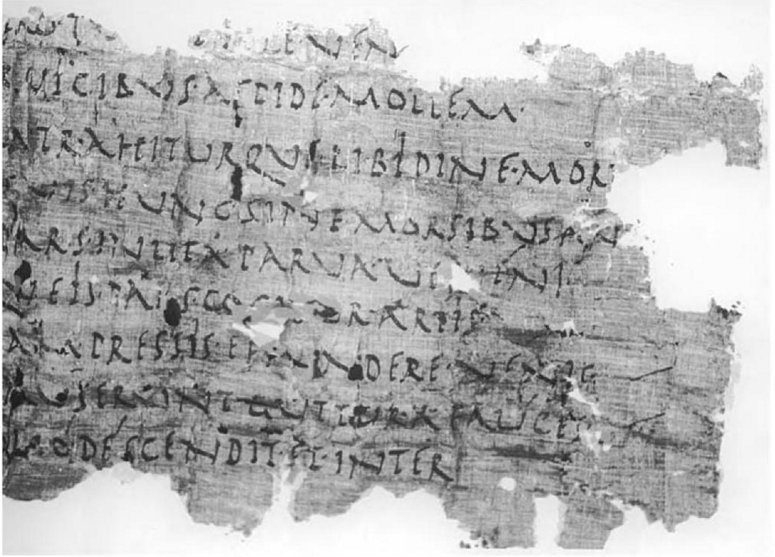
New Roman Cursive marks the birth of the earliest alphabet that even an untrained eye would likely recognize.
Letterforms at any given point in western history heavily influenced the evolution of the many different styles we know today. However, Roman Cursive is probably the most pivotal foundation of those styles. Its roots influenced and cemented the anatomy of the letters we have been writing for centuries and eventually gave birth to countless serifs and sans-serif fonts we use in our word processors. In a sense, Roman Cursive is the great (great, great, etc.) grandfather of today’s many styles of western calligraphy.
Uncial Script (2nd – 8th Century AD)
The earliest traces of Uncial script were discovered to be from the late 1st century and early 2nd century, but its era of popularity and common usage was between 4th and 8th century. Uncial script likely developed from Roman Cursive. However, there are several distinct features that really set this style of script apart. The broad edge used to create the strokes of these letterforms is the first in Western history and the correlations between them and the letterforms we know today in modern styles of Blackletter is visibly apparent.
Unlike Roman Cursive, Uncial’s broad strokes are also rounded. Interestingly enough, it is speculated that this new treatment was made possible by the development of parchment and vellum. These materials were much smoother and allowed for such manipulation of the writing instrument, as opposed to rougher surfaces like papyrus.

This approach to writing also enabled the scribe to write faster and more fluidly. Speed is a major aspect of writing calligraphy that helped influence many developments in different styles calligraphy. This particular instance is perhaps one of the earlier examples, but it is a trend we’ll continue to see in later centuries.
The origin of the name isn’t definitive. The earliest reference to the style comes from the St. Jerome’s preface of Book of Job. Within the preface, he writes:
Habeant qui volunt veteres libros, vel in membranis purpureis auro argentoque descriptos, vel uncialibus ut vulgo aiunt litteris onera magis exarata quam codices.
Which translates to:
“Let those who so desire have old books, or books written in gold and silver on purple parchment, or burdens {rather than books} written in uncial letters, as they are popularly called.”
Many believe the name is based upon the Latin word “uncialis”, which can translate to mean “inch high”. This would make sense as early Uncial scripts were generally written between 2 horizontal baselines that were about an inch apart from each other.
Classic Uncial script is a majuscule alphabet, so all of its letterforms are written as what we know to be uppercase.
Half/Semi Uncial (6th – 8th Century AD)
The Uncial style of script was one that slowly developed over centuries and eventually gave way (around 6th century) to what we now refer to as either Half Uncial or Semi Uncial. Half/Semi Uncial introduced lowercase versions of its predecessor’s majuscules along with ascenders and descenders. And as the years went on, scribes began to introduce ligatures, as well as embellishments and flourishes. The broad nib was twisted to add different characteristics to the core strokes of the letterform.

The use of Half/Semi Uncial script began to taper off as it evolved into other unique and more regionalized hands. However, it was still used by the Christian church until ~10th century as the primary hand for biblical transcription.
Notable Descendants of Uncial Script (6th – 13th Century AD)
It is important to recognize the influence that Uncial script had across the western world. During the Middle Ages, Western Europe’s overall deterioration resulted in many instances of regional division, migration, and displacement. This division promoted the unique interpretations, treatments, and techniques of Uncial writing.
While many of these styles of writings may be relatively unknown and short-lived in common use, the roots they established are still recognizable today in the cultures of their respective modern regions.
Merovingian (7th – 9th Century AD)
Also known as “Gallo-Roman” script, Merovingian script was central to the Merovingian dynasty, a dynasty in the region where France is today. The Merovingian dynasty lasted several centuries until the 8th century when it became the Carolingian monarchy. As a result, the writing in the region eventually adopted Carolingian scripts.

Merovingian script was primarily used in monasteries and interestingly enough, it is known to have 4 distinct variants; each unique to its respective monastery. The 4 monasteries were: Luxeuil, Laon, Corbie, and Chelles. The script is distinct In appearance due to its narrow and sharp letterforms. The ascenders and descenders of its minuscules are often long and exaggerated.
Insular (6th – 9th Century AD)
This medieval script was written in Ireland under the influence of Irish Christianity around the same time as Merovingian script. The appearance of Insular script should be distinguishable to those familiar with “traditional” Irish and Gaelic scripts, as those scripts were directly influenced by Insular script.
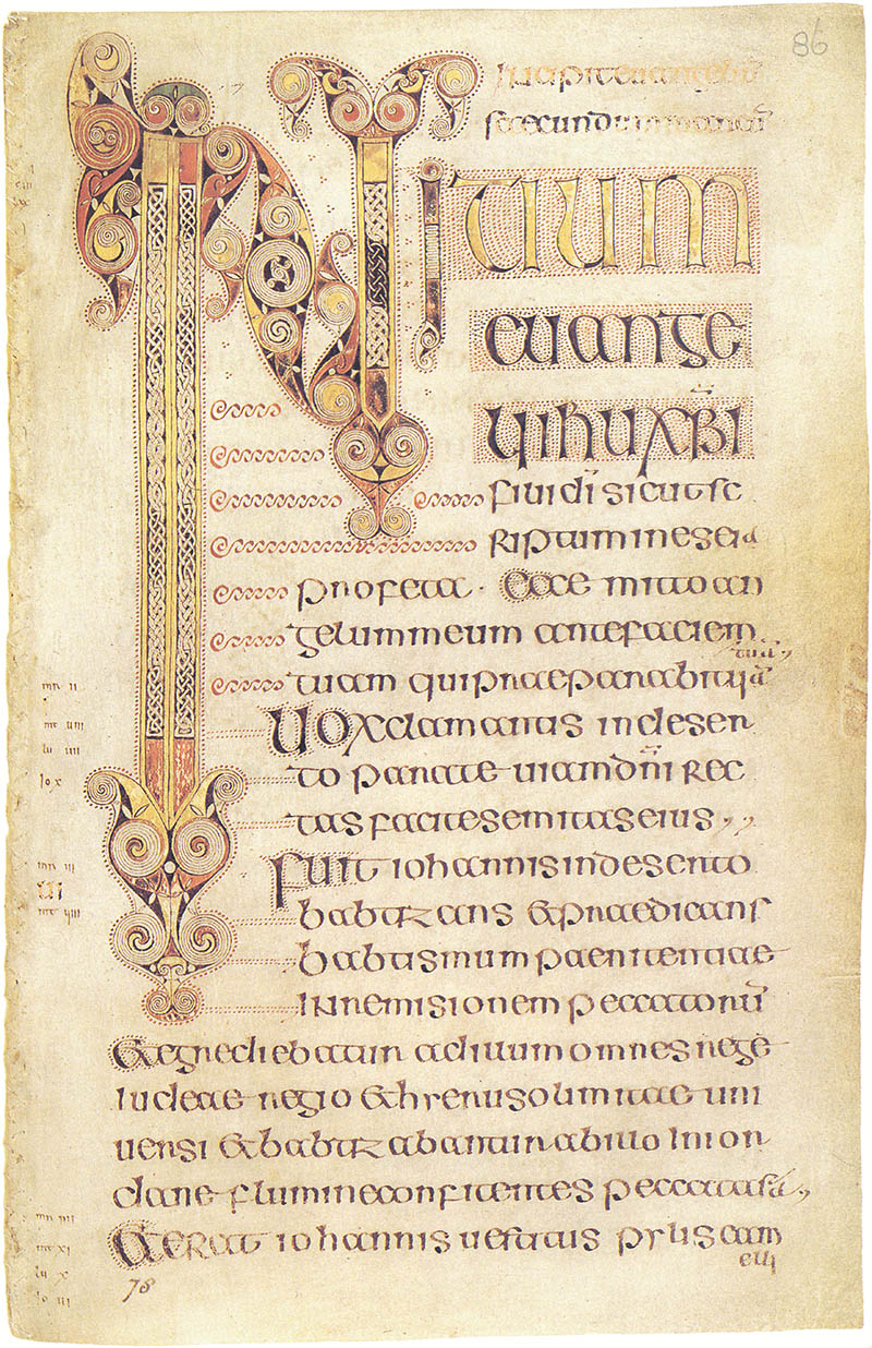
The differentiations within Insular script varied based on usage scenario. The most formalized examples of the script are found in important documents and sacred texts. This style was perhaps the most tedious due to the time required to produce the letterforms. Casual variations were used in less formal documents and notes in favor of letterforms that were quicker to write.
Visigothic (7th – 13th Century AD)
Meanwhile, down south on the Iberian Peninsula (which is now modern Spain and Portugal), were the Visigoths.

Finally a mention of “Gothic” — perhaps one of the more common and generic terms used to describe modern Blackletter calligraphy. However it’s not entirely accurate in this context. Gothic is actually a language spoken by the Goths, an Eastern-Germanic people (comprised of the Ostrogoths and the Visigoths). These tribes played a key role in the fall of the Western Roman Empire in the late 4th century.
Visigothic script was used from the 7th century through the 13th century, but its heyday was 9th-11th century. It declined gradually thereafter. The script is comprised of elements that stay true to its Uncial roots, but similarities to Merovingian can be seen in its long, slender letterforms.
Beneventan (8th – 13th Century AD)
The Beneventan script was used originated in the Duchy of Benevento (a duchy is a territory ruled by a duke or duchess), an area of Southern Italy. It existed around the same time as Visigothic script (specifically 8th century to 13th century), and was primarily used in the monasteries of Bari and Monte Cassino.

Visually, Beneventan is very distinct, particularly when compared to other scripts that were heavily influenced by the Uncial writing of previous centuries. Perhaps the most distinguishing feature of Beneventan script is the rythmic connectivity of its letterforms. Words are grouped together with the prominent use of ligatures and other connecting strokes.
As far as a writing system, Beneventan script was also unique in that it would omit or abbreviate letters, often with a preceding macron (a mark above a letter to denote a long or stressed vowel) as an indicator. This was a concept we saw in earlier Roman Cursive, but unlike Roman Cursive, standard punctuation and word spacing is used in Benevantan script. In fact, one particular piece of punctuation was for interrogative clauses — one of the earliest forms of a question mark that we’ve found in Western writing.
Carolingian Minuscule (8th – 12th Century AD)
The Carolingian Empire, ruled by the Carolingian Dynasty during the 8th century was a large empire in Central Europe that gave way to the Carolingian Renaissance — one of the major renaissances during medieval times. This period of growth gave way to an increase and advancement of many cultural aspects. Of those aspects, writing and literature were major components.
It was speculated that Emperor Charlemagne (emperor of the Carolingian Dynasty) was not particularly literate in his own right, but still pursued learning. In fact, a Frankish scholar named Einhard, who was known for writing a biography of Charlemagne, wrote:
Temptabat et scribere tabulasque et codicellos ad hoc in lecto sub cervicalibus circumferre solebat, ut, cum vacuum tempus esset, manum litteris effigiendis adsuesceret, sed parum successit labor praeposterus ac sero inchoatus.
Which translates to:
He also tried to write, and used to keep tablets and blanks in bed under his pillow, that at leisure hours he might accustom his hand to form the letters; however, as he did not begin his efforts in due season, but late in life, they met with ill success.

Despite his lack of success in this area, Charlemagne still recognized the importance of cultural literacy. He sent for Alcuin of York, an English scholar from Northumbria (modern Northern England/south-east Scotland) and had him establish a palace school and scriptorium. Scriptoriums were rooms or centers dedicated to writing, particularly in monasteries where manuscripts and religious texts were copied. During this time, the production of literature increased and linguistics of the time were standardized in the interest of unifying communication throughout the large and continually expanding empire. As a result of these efforts, Carolingian minuscule (also known as Caroline minuscule) emerged as the calligraphic standard throughout the large European empire.

The development of Carolingian script was primarily influenced by English and Irish monasteries using Roman Half/Semi Uncial and Insular scripts, respectively. The letterforms are comprised of rounded strokes that make up clearly individualized glyphs. Sentences used punctuation and began with a capital letter. The words within were separated with spaces and ligatures were used sparingly to promote legibility.
Over the course of the next couple centuries, Carolingian scripts matured into a writing system not far from system we’re familiar with today. Letterforms with descenders began to slant in a natural direction, as opposed to their uncial predecessors. Modern version of certain glyphs began to appear, like the s, which up until this time was traditionally written in a longer vertical stroke (similar to that of an f). The letter v became distinctively different than u. And for the first time, the letter w began to appear. Carolingian minuscule was also the first hand that featured a dotted i.

Carolingian minuscule’s influence rippled throughout Europe, particularly where Carolingian influence was commonly present, but also throughout other parts. For example, the script is present in the Freising manuscripts, which contains the first Roman-script record of the Slavic language. Its influence can also be seen in areas such as Switzerland, Austria, Germany, and Italy, among others.
Carolingian scripts were eventually superseded by Blackletter in the mid 11th century.
Textura/Textualis (11th – 17th Century AD)
The 11th and 12th centuries saw a notable increase of literacy throughout Europe. Beyond bibles and religious manuscripts, books of varied subjects such as business, law, grammar, and history were produced as a result of newly established universities.
The demand for these books was high. Keep in mind this was a couple hundred years before the invention of the printing press! Each book was written by hand and they needed to be produced quickly.
Despite Carolingian minuscule’s legibility, the large letterforms took a while to produce and also occupied a considerable amount of manuscript space. Writing materials were costly at this time, so there was no doubt that Blackletter was birthed for economic reasons.
The Blackletter styles that transformed from Carolingian minuscule in Northern Europe during the 11th and 12th century are referred to as textualis hands (also known as “Textura”, or “Gothic Bookhand”) and is considered to be the foundational form of Blackletter that eventually evolved into other styles of Blackletter in later centuries.

This style of script is the one that is most synonymous with the term “Gothic”, compared to it’s Southern European counterpart Rotunda. It was most commonly used in England, France, and Germany, but even within close regional proximity of each other, these countries all celebrated nuanced interpretations of the script.
English forms came in many varieties, according to Wikipedia:
English Blackletter developed from the form of Caroline minuscule used there after the Norman Conquest, sometimes called “Romanesque minuscule”. Textualis forms developed after 1190 and were used most often until approximately 1300, afterward being used mainly for de luxe manuscripts. English forms of Blackletter have been studied extensively and may be divided into many categories. Textualis formata (“Old English” or “BlackLetter”), textualis prescissa (or textualis sine pedibus, as it generally lacks feet on its minims), textualis quadrata (or psalterialis) and semi-quadrata, and textualis rotunda are various forms of high-grade formata styles of Blackletter.
Texturalis Blackletter generally suffers in legibility compared to its Carolingian predecessor. Instead of wider rounded letterforms, it is comprised of straight and narrow letterforms, each of which are evenly spaced with vertical downstrokes that create a uniform rhythm across the page. This calculated uniformity is evocative of the gothic architecture of the time. Consider how cathedral windows are spaced with strong verticals. It could be speculated that this style of writing was also a nod to the church.
Johnannes Gutenberg introduced the movable type printing press (known as the Gutenberg Press) in the 14th century and hand-carved textualis letterforms to print the Gutenberg bible. This was the first ever mass-produced book printed with movable type and the limited copies remaining today are considered to be one of the most valuable books in the world.
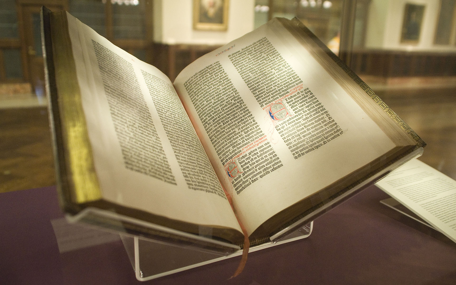
The 14th century also saw the introduction of paper, which was much easier to write on than parchment. This helped to influence the development of what we now refer to as “cursiva”. Cursiva is a broad term used to simplified Blackletter scripts. These versions are typically less rigid and broken apart than traditional textualis variations, which features strong sharp lines.
While not one specific style of script, cursiva interpretations of early Blackletter script played a large role in their eventual evolution in later centuries, particularly in Germany.
Rotunda (12th – 17th Century AD)
Rotunda originated in Italy and is considered to be the textualis sibling of Southern Europe. It’s direct influence of Carolingian minuscule is more obvious than textualis.
The name itself is derived from the Latin word rotundus, which refers to a building that has a round, circular floorplan. While Rotunda letterforms share many of the same structural qualities as textualis letterforms, they contain more rounded strokes. This adds a considerable amount of variety to the alphabet and makes the style far more legible, even when written narrowly.
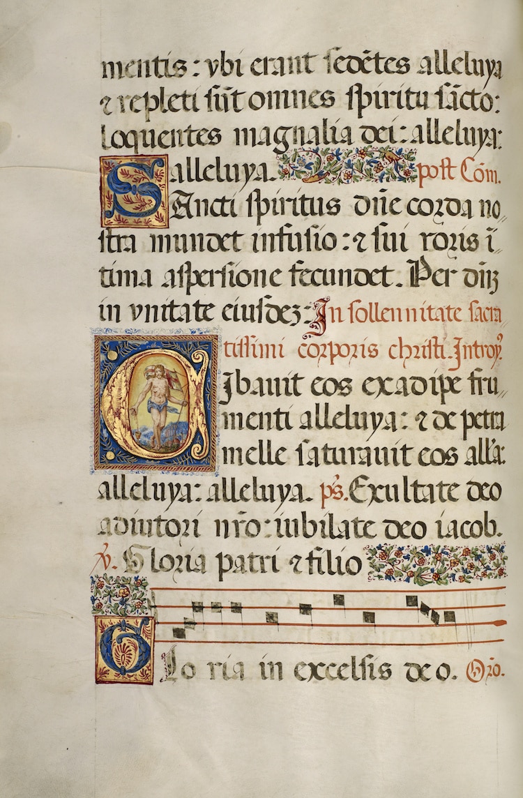
In later centuries, Blackletter became less popular in Southern Europe as chancery, Antiqua script and other modern cursive and italic hands became more widespread for practical reasons.
Bastarda (14th – 16th Century AD)
Bastarda (also known as “hybrida”) is an evolved variety of textualis for,s that surfaced in Northern Europe in the late 14th century. True to their name, bastarda scripts can be characterized as bastardized treatments of textualis since the style itself is defined as a hybrid mix of traditional textualis and the simplified cursiva styles that came about thereafter.

Bastarda scripts were quicker to write as their letterforms involved less reorientation of the pen. The deliberation of formality and consistency ranged contextually. Some manuscripts were carefully written while other forms of correspondence were loose and more informal. Because of this spectrum of application, as well as the regional varieties and nuanced treatments of the letterforms, bastard fonts are difficult to categorize holistically.
Schwabacher (14th – 15th Century AD)
One particular bastard style worth noting is Schwabacher. Schwabacher script was primarily used in Germany in the 14th and 15th centuries, but could also be found in Switzerland during the same time. From the late 14th century to the early 15th century, it was the predominant typeface used in print throughout Germany.
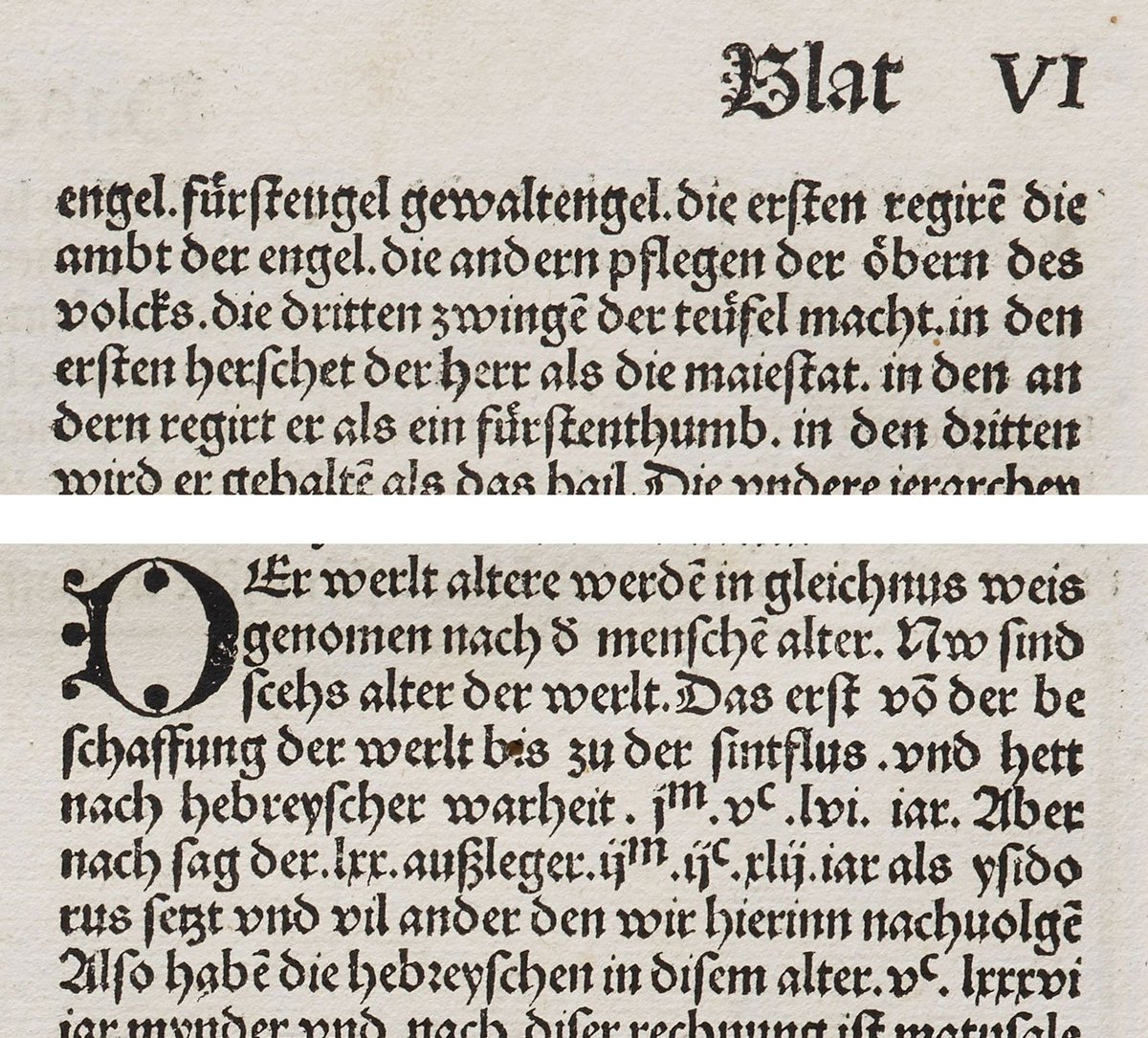
The combination of rounded forms blended with the formal textualis strokes suggest the script’s hybrid nature draws from the influence of earlier rotunda scripts. In later centuries, Schwabacher was largely replaced Fraktur.
Fraktur (16th – 20th Century AD)
At the turn of the 16th century, a German emperor named Maximillian laid out plans to open an exquisite library. Fed up with the difficult-to-read textualis hands, he had his chancery Leonhard Wagner work with Hieronymus Andreae (a renowned woodblock cutter of the time) to develop a new typeface. This typeface became known as Fraktur.
The word Fraktur is derived from the Latin word “fractus”, which means “broken”. This word translates to English as “fracture” and the meaning is actually quite accurate as Fraktur letterforms are broken apart into fractured strokes laid out at many angles. This variety of angles is a major aspect of what makes Fraktur more legible, particularly when compared to classic forms of textualis hands, which were vertically rigid and narrow.
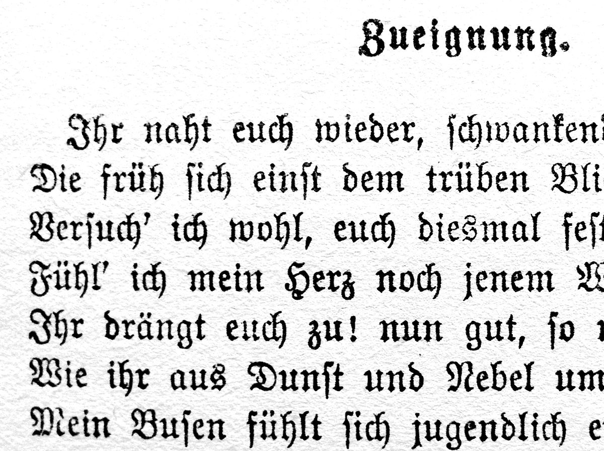
Fraktur quickly rose in popularity as it was printed and distributed throughout the country. Interestingly enough, for a time it marked a distinction between catholic and protestant texts. Protestants printed in German using Fraktur while catholics printed in Latin using various types of Antiqua.
With the technological breakthrough of print, the mass-production of text kicked into full swing during 15th century Europe and the most commonly used typeface in these productions was Antiqua. Antiqua was not a calligraphic script, but it was designed to look like one. And while it’s not considered a Blackletter face, gothic influence can be found in its letterforms.
With the exception of Germany, use of Antiqua eclipsed the use of Blackletter scripts throughout Europe after its rise in popularity in the 15th and 16th centuries. However, German Fraktur coexisted with Antiqua until the early 20th century. Throughout the centuries in which both were prominent, there was great debate on which was the “correct” typeface to use.
Fraktur didn’t fall out of popularity until the WW2 era with the rise of the Third Reich. Much of the Nazi propaganda was printed using this hand and the style eventually (and unfortunately) became synonymous with the Nazi Regime. Coincidentally, Hitler actually ordered to terminate the use of Fraktur in favor of Antiqua because it wasn’t widely recognized outside of Germany. However, this order was never effectively carried out.

Because Fraktur influence never really reached beyond German borders, it was always considered to be “German” in essence during its heyday. Any Blackletter script produced in Germany during these golden years is considered Fraktur, despite nuanced differences and localized treatments. With that said, it is worth noting that there is no single “official” version of Fraktur.
Modern Day Blackletter (16th – 20th Century AD)
Blackletter calligraphy (and Blackletter typefaces) fell out of use in the 16th century due to the emergence of Antiqua. Germany was the sole exception, as we saw, with Fraktur calligraphy holding its ground until the end of World War II. Blackletter slipped into the past after this time and never saw a resurgence until nearly a century later.
Today, we celebrate Blackletter calligraphy, hand lettering, and modern Blackletter typography as a form of art that is no longer confined to its utilitarian roots — and hopefully no longer widely associated with its dark historic past (I’m looking at you, Fraktur).
A major aspect of what makes this form of art so amazing is just how old these varieties of visual language really are. The work we know, love, and create today is the product of thousands of years of development.
Thanks to this time of celebration, we’re also witnessing a new chapter of language take place before our very eyes.
Calligraffiti (Present Day)
With the emergence of graffiti and street art in the past 40 years, typography has become a common form of artistic expression. Original styles are being developed without any formal training in typography. Graffiti has exploded into a brand new culture. This urban aesthetic has influenced and encouraged new kinds of lettering artists. While graffiti might not be a direct form of Blackletter calligraphy in and of itself, it has given way to a new form of calligraphy — one I’m confident will continue to grow over the course decades and write new chapters to an already-long story of visual language and typographic expression.
By definition, calligraffiti combines calligraphy, typography, and graffiti. And in a time where technological communication is no longer limited to print, calligraffiti has exploded around the world.
Like all modern grassroots art movements, there aren’t many formalities or official authorities on the subject. While the origin of the term is unclear, it was popularized by Dutch artist Neils Meulman, a graffiti writer who identifies by the alias “Shoe”, when he held his solo exhibition “Calligraffiti”. Shoe describes calligraffiti as “traditional handwriting with a metropolitan attitude” and a “way of translating the art of the street to the interior of museums, galleries and apartments.”

Due to its expressive nature, loose definition, and lack of rules (some might even argue that like graffiti, rules are paradoxical in nature in the context of calligraffiti), it is a broad style, leaving an often abstract subject matter up to personal interpretation. And while the movement originated in western culture, calligraffiti is by no means confined to the west. It can be found everywhere.
Calligraffiti is also very young. As a result, there is a limited history to report on. And while there is no doubt that is is a large departure from classic calligraphy, its continuation of a long history of written language and visual expression cannot be denied.
Conclusion
If you’ve read this far, you must love history as much as I do. Hopefully this deep-dive was comprehensive enough to give you a robust understanding of what Blackletter history is comprised of.
Whether you’re yet to pick up a pen or you’ve already started learning to write Blackletter, this knowledge will serve you along your journey.
Further Learning
At this point in time, you might be wondering where to go next. No worries — I have you covered. This site is packed with free resources to help you in your creative endeavors. Now that you have a solid background, consider diving into some introductory lessons to learn one of the four core styles of Blackletter.
- Textura
- Rotudna
- Bastarda
- Fraktur
If you’re already convinced and committed to taking your learning to the next level, I’ve created a series of premium books to guide you in a linear path to mastery. Each of these four books covers one of the four styles of Blackletter calligraphy in extensive detail (Textura, Rotunda, Bastarda, and Fraktur).

These books are available digitally on my website (and can be printed just like these free worksheets).
The post The History of Blackletter Calligraphy appeared first on Jake Rainis.